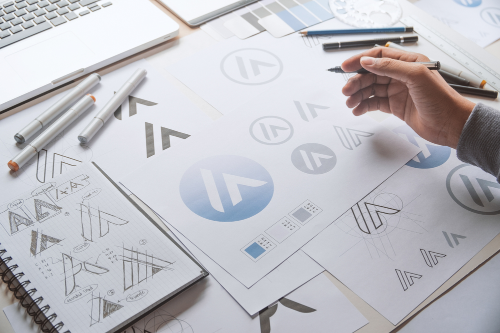
If you haven’t taken the time to establish a researched foundation, defined a name and brand palette yet – stop. Go back and start the process over to avoid jumping ahead to this, the most anticipated and exciting part of branding – your logo.
6. Design Your Logo
When someone says “brand” to you, a logo is probably the first thing that comes to mind. Although just an expression of your brand’s image, a logo is the “face” of your company, and will likely be everywhere your brand lives.
Functionally, you’ll want to design a logo that is truly unique in it’s design and identfiability. Most importantly, you’ll need a logo that is scalable and legible at all sizes – including very small.
Be sure take into consideration all of the many places your brand’s logo will be placed, from your social channels to your website pages, including the tiny 16×16 pixel favicon on your browser.
Text based logos are not ideal for social channels, as they often constrain your logo size to a very small container. I recommend trying to fit your logo into a small, square box, and possibly include an icon that represents the brand visually overall.
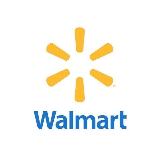
Take note how big brands use their icon and wordmark together – but they both iconically represent the brand individually when not combined.
Consider these logo types you can try to help you communicate with a professional design to help determine a style that suits your brand. Don’t forget to include the color palette and fonts you’ve already selected.
Abstract: Google Chrome
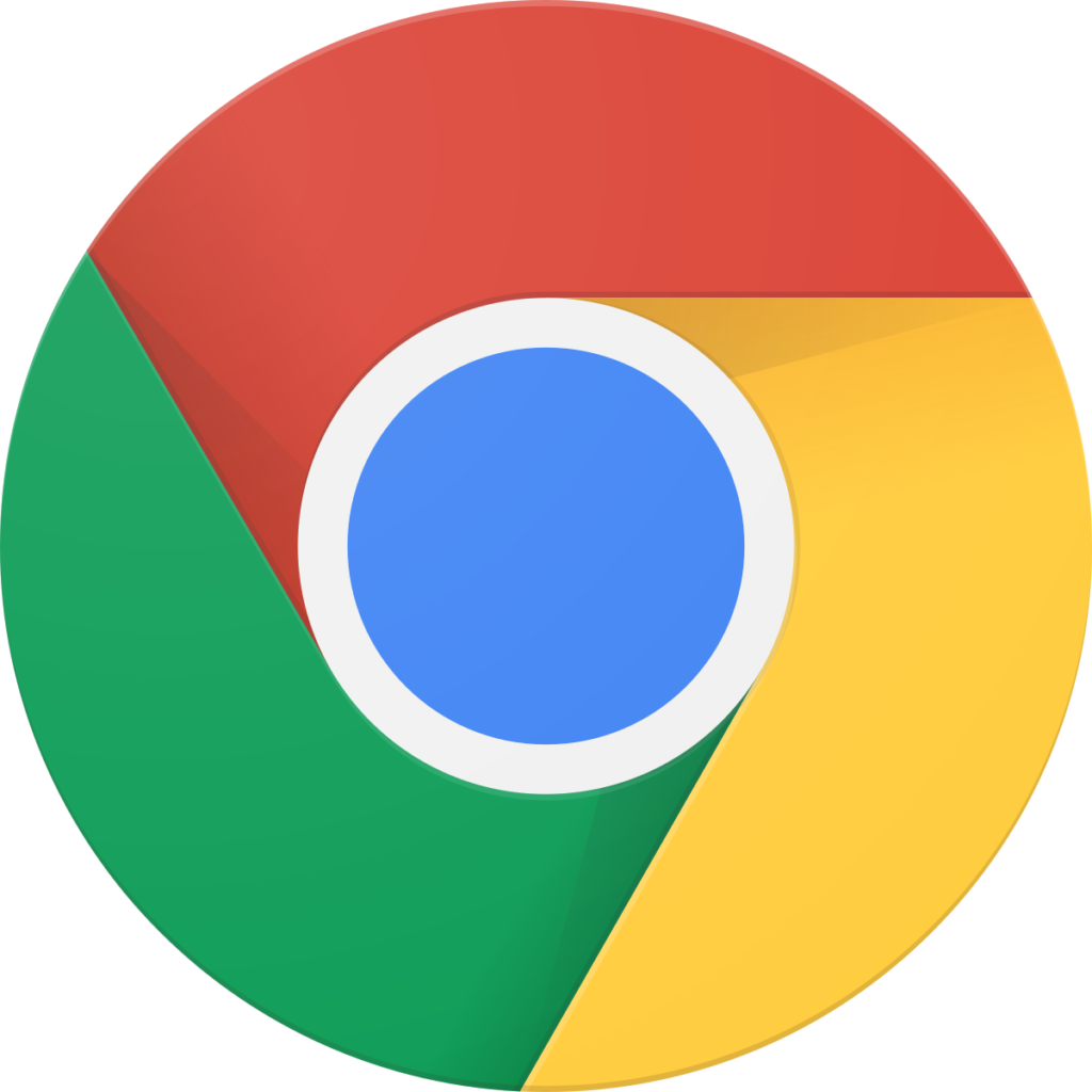
An abstract logo has no explicit meaning. It’s just a shape and colors that you can’t easily tie back to anything in the real world.
The benefit of an abstract logo is that it has no innate meaning—you can make this up yourself and bring it to life in your customers’ minds.
Mascot: Wendy’s
Mascot logos are often represented by a character of some sort. They serve to humanize the brand, but are waning in use and popularity. If you’re going to a retro feel for your logo, however, a mascot may just the thing.
Emblem: Starbucks
Most often circular or shield in shape, emblem logos convey a royal position for the logo. If too complex in design, they can often lose a good deal of readability at smaller sizes. Done correctly, an emblem logo can convey a memorable impression of your brand.
Lettermark: IBM
Lettermark logos are simply the initials of your full business’ name. Names with 3+ words get a bit long and cumbersome. However, if you’re initials are short and catchy, this can be one of the most effective forms of logos.
Icon: Twitter
Icons are metaphoric representations of brands. Icon logos suggest some attribute of the product. In this case, Twitter’s bird evokes the “tweets” the brand platform provides.
Unestablished brands should refrain from using an icon based logo without text. Pairing an icon logo with a wordmark is generally a good bet.
Wordmark: Facebook
Wordmark logos turn your brand name, colors, and font into a singular visual identity. The challenge with wordmarks is that they’re often difficult to develop in a square shape, and can lose readability at small sizes.
Combination: McDonald’s
Due to the inherent limitations that exist for each logo type, most logos are a combination of styles.
As new brand, you may not need to choose an icon over a wordmark when you can get the best of both. This helps create a scalable logo while keeping your name front and center. For example, McDonald’s can place their iconic golden arches wherever a full wordmark won’t fit.
Unless you’re an accomplished designer yourself, you’d be wise to engage a professional to design this important part of your brand for you. True, you can outsource it to “logo farms” like Fiverr, but you may not get the level of focused creativity and thoughtful design that you would from a freelance artist.
Now that you have a solid foundation for your brand, you need to make the effort to ensure it can evolve with time. That’s next in our final installment of “Branding 101”.
